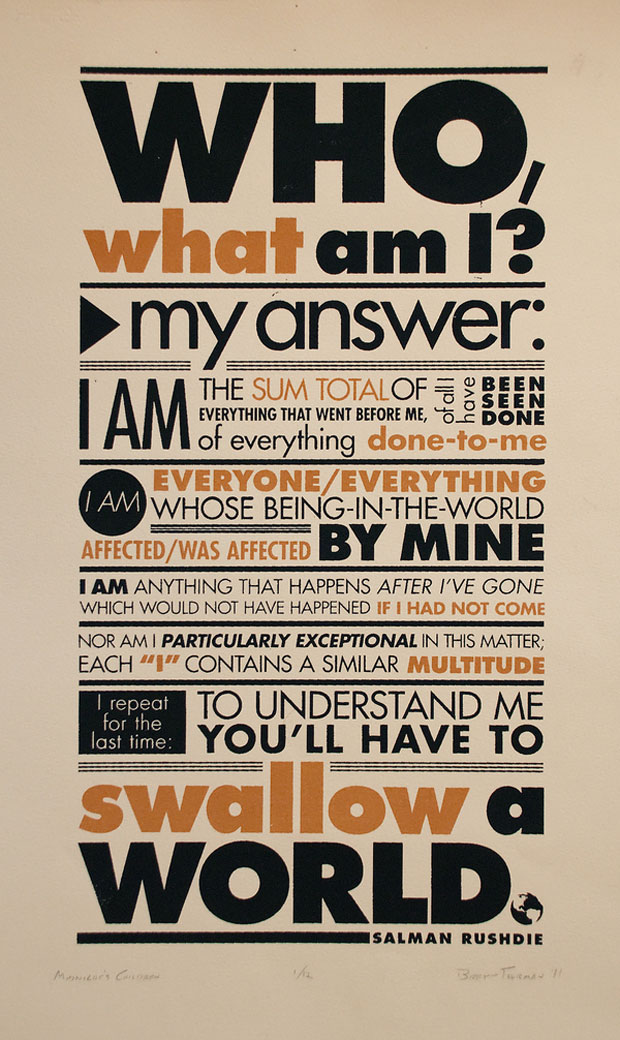
Mightnight's Children
University ProjectThis typography project for school was mostly self directed. I wanted to display one of my favorite quotes from my favorite book in an interesting & eye-catching way. I have always loved the handmade printing & packed type of the old broadside style posters & wanted to utilize this style to put emphasis on the words, & not let any illustration distract from it. I roughed up the type because I wanted the poster to feel worn & weathered like Saleem, the character who utters the quote.


